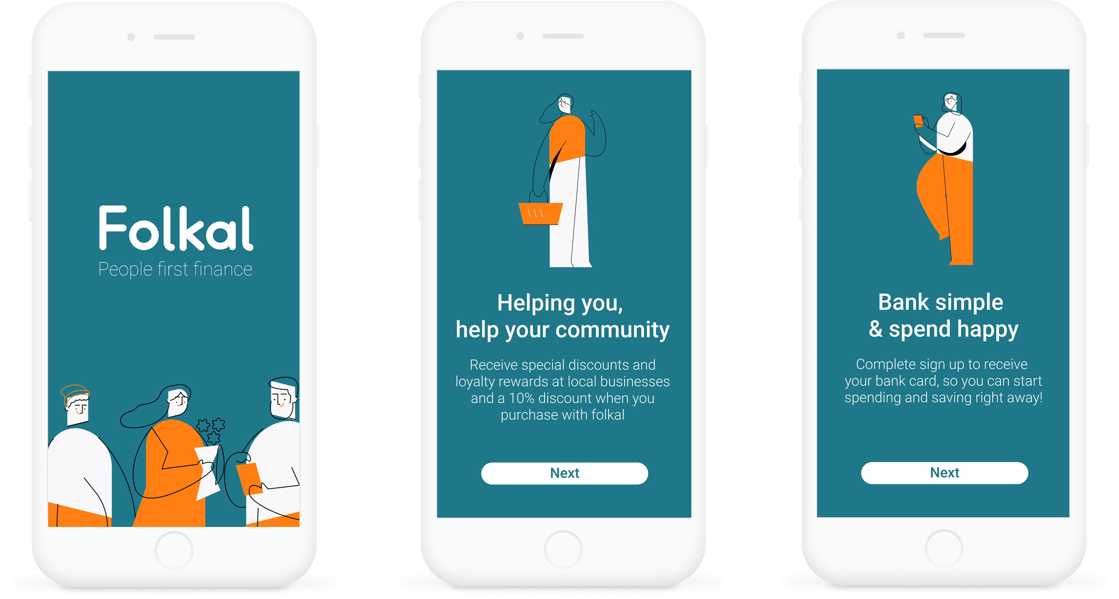
An independently developed concept for a (mobile-first) responsive banking, e-wallet and shopping web app. The product aims to be an intuitive finance tool that also incentives support for local independent businesses.
My role
Sole end-to-end designer, from user research,
prototyping, testing, right through to the UI design.
prototyping, testing, right through to the UI design.
Tools
Pen and paper, UsabilityHub, Optimal Workshop, Sketch,
Figma, Zoom, Illustrator, InDesign and Photoshop.
Figma, Zoom, Illustrator, InDesign and Photoshop.
The problem
Many small businesses have been struggling with the economic effects of the pandemic. Consumers enjoy the convenience of shopping online with sites such as Amazon but feel guilt in giving their money to large multinationals. Many instead would like to support their local community with the same kind of convenience. Doing this in an experience that's secure, sustainable and rewarding for them both.
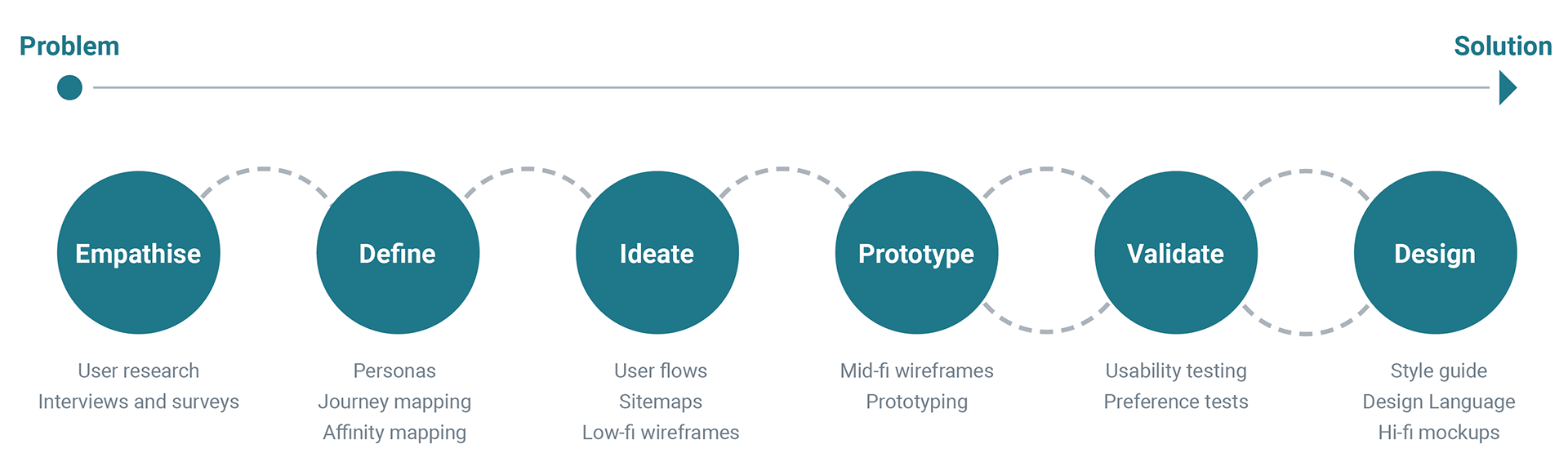
Process and timeframe
I worked through a clearly defined UX design process (visualised in the figure below) from Nov 2020 – Feb 2021. This process enabled me to reach my goal of a high fidelity prototype concept solution to present.
1. Empathise | researching the audience
Competitive analysis using S.W.O.T
The fintech market is very competitive, constantly having new products hitting the market, so anything new will need to stand out and offer something unique. There also seems to be new kinds of shopping applications such as Klarna developing as well, which take quite an unethical approach to promote shopping with interest-free loans to young target audiences. Using S.W.O.T (Strengths, Weaknesses, Opportunities and Threats) helped identify gaps in the market and possible concepts ideas for filling them. As well as identifying features and paths that work well with existing products such as quick logins and friendly personable tones of voice and style. Steering away from traditional dry informative approaches to banking.
User interviews
I conducted user interviews with five participants that helped gather useful insight into their banking and shopping habits, pain points and ideas about possible useful functions. Due to COVID-19 pandemic safety measures, all interviews were done via zoom meetings.

2. Define | Understanding the problem
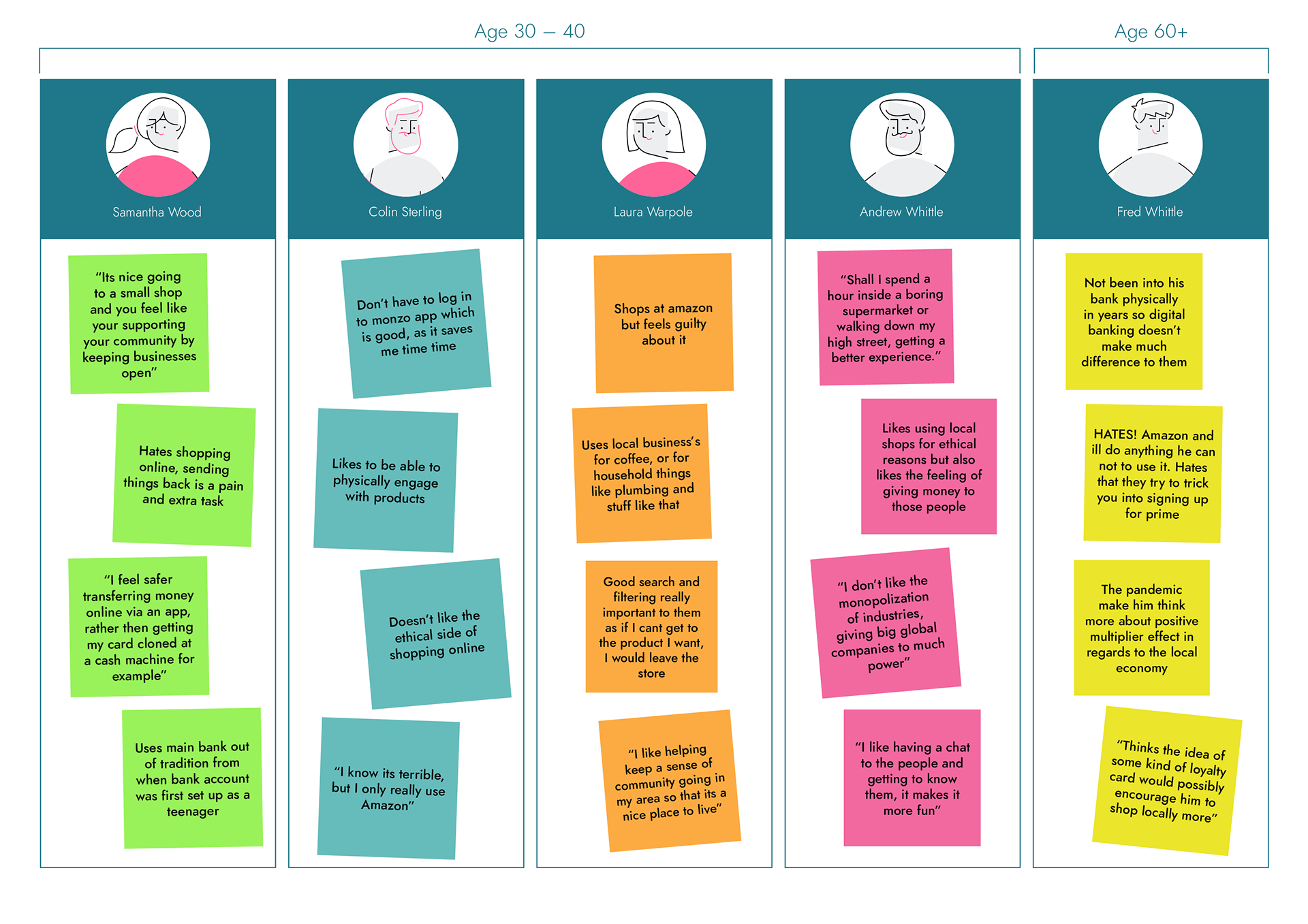
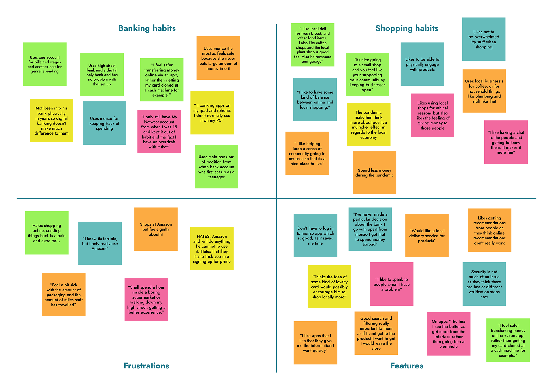
Affinity mapping
To inject some personality into my research, I grouped all insights from my interview research into user habits, frustrations and features, using an Affinity Map to help visualize common patterns and themes.
Developing personas
Using the findings from my research I was then able to create user personas to give needs, frustrations and feelings to my research and always have somebody to review back to at each development stage.
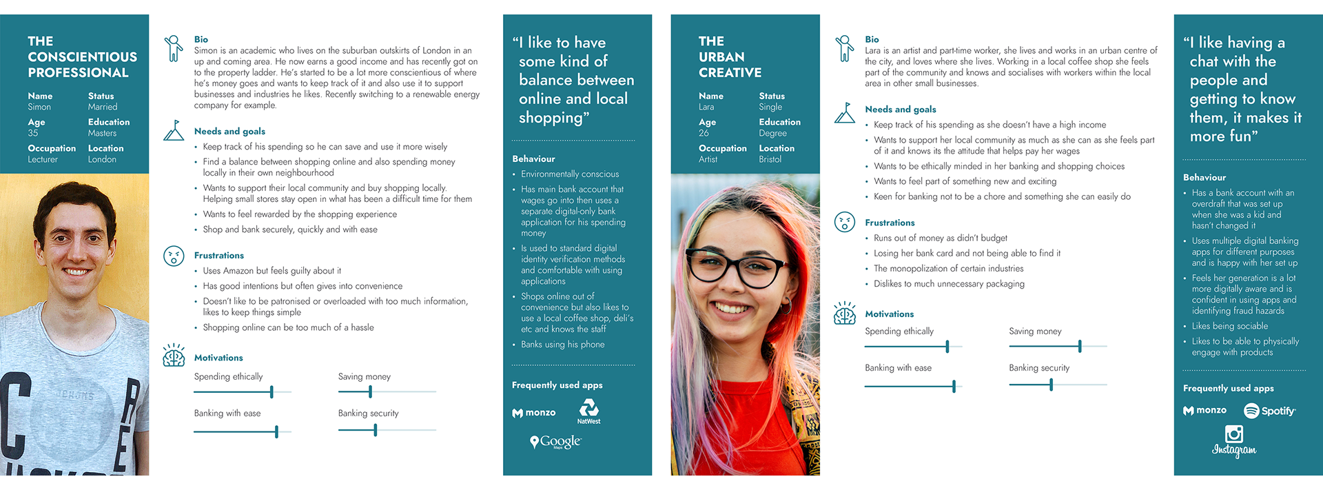
User journeys
Simon is an academic who lives on the suburban outskirts of London in an up and coming area. He now earns a good income and has recently got on to the property ladder. He’s started to be a lot more conscientious of where he’s money goes and wants to keep track of it, also to use it in supporting businesses and industries he likes. Recently switching to a renewable energy company for example.
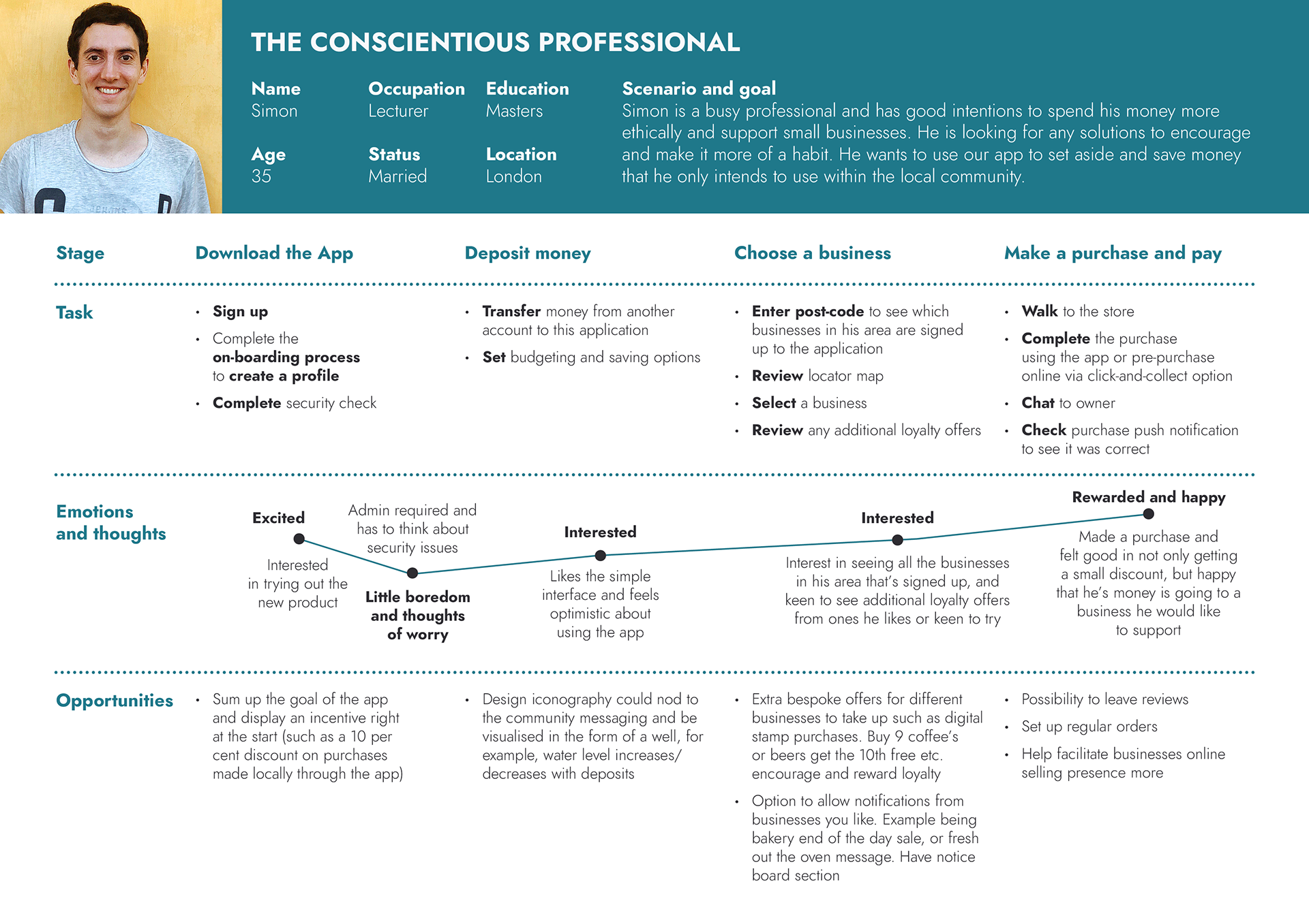
To better understand the experience Simon would go through when using the product, and to identify the paths and features needed for Simon to achieve his goal, I created a customer journey map specifically with him in mind.

3. Ideate | Generating ideas and solutions
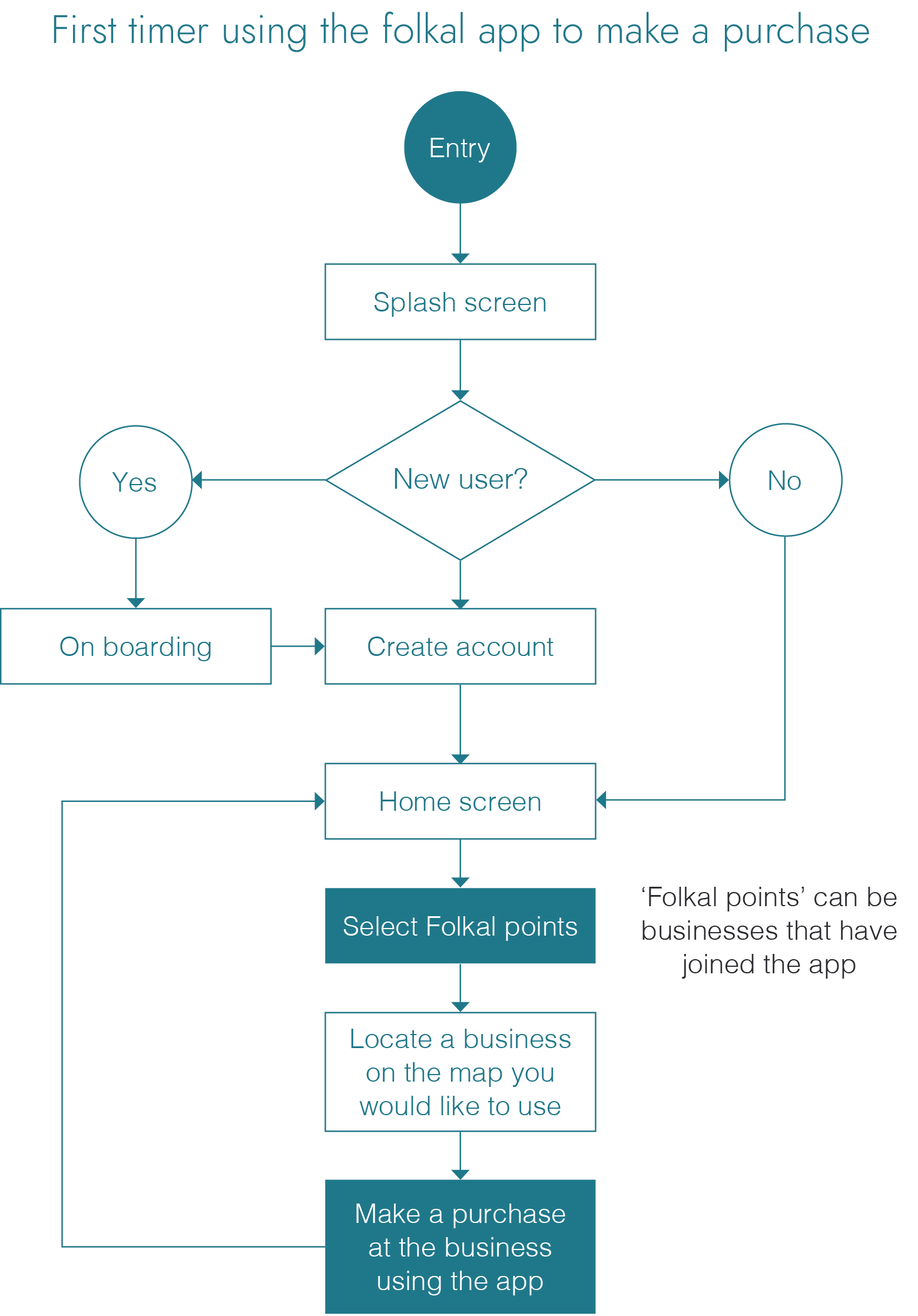
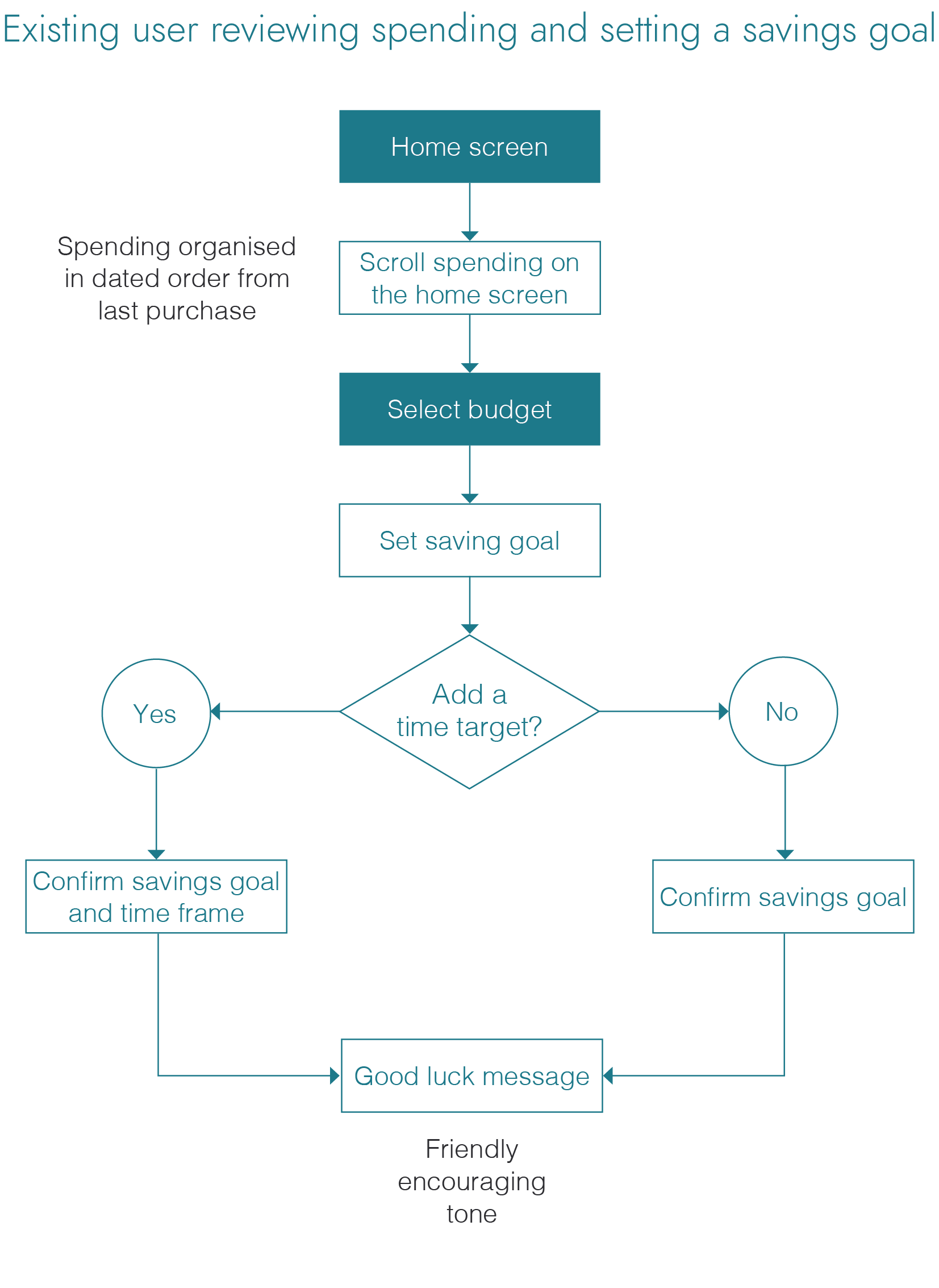
User flows
Now with my persona in mind, I could map out a variety of user flows to enable me to work out the user paths and functions required for the functionality of my product.
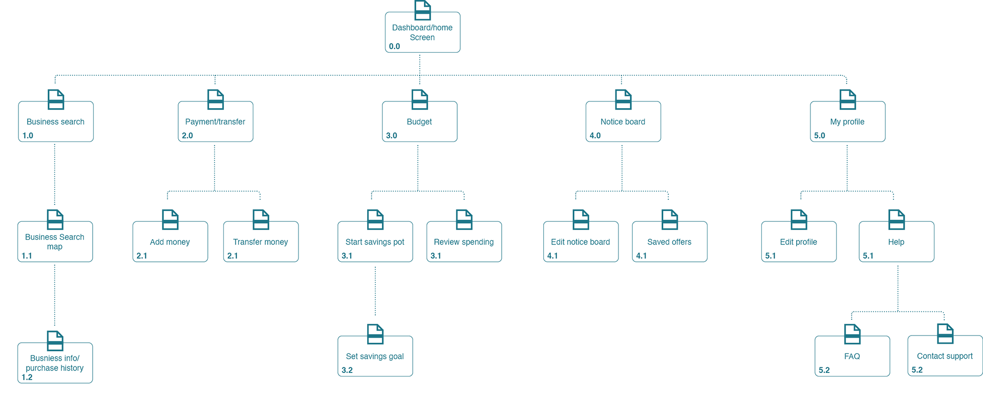
Sitemap
Now after identifying the major paths and features of the app, I'm able to map out the information architecture to organise its hierarchy. Then to ensure the structure and navigation of the product is as intuitive as possible.
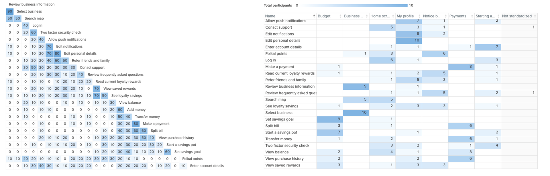
Card sort data
I also conducted an open/closed hybrid card sort which allowed me to make iteration to the sitemap. Helping validate my information architecture, but also highlighting the need to make a couple of changes to page titles.

4. Prototype | Creating the key features
Low fidelity wireframes
Now with clear paths and sitemap hierarchy, I moved into initial sketching and laying out. Helping flesh out ideas, seeing what does and doesn’t work. Helping me reduce the amount of information and hopefully make the user have better heuristics options and a more intuitive product. Also using the paths to inform what the key features need to be.

5. Validate | Usability testing
Test objectives
Determine if participants understand what the app is about quickly and easily and the value it provides.
Check the heuristic choices are correct and that the product is intuitive and easy to use.
Observe how users navigate and find information about businesses and banking options and that they can
successfully find what they’re looking for.
successfully find what they’re looking for.
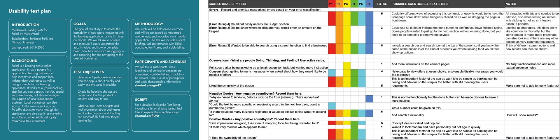
The testing process
I created a test plan to outline what I wanted to achieve. I also wrote and developed a test script and rainbow spreadsheet, using the Jakob Nielsen method of severity ratings to grade any usability problems.
Key findings and elevating fidelity prototypes
Using a combination of pen, paper, Sketch and Figma I gradually elevated the fidelity of my prototypes. Utilising user testing, A-B testing and peer review results and data to refine the product.
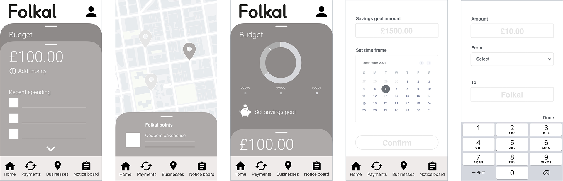
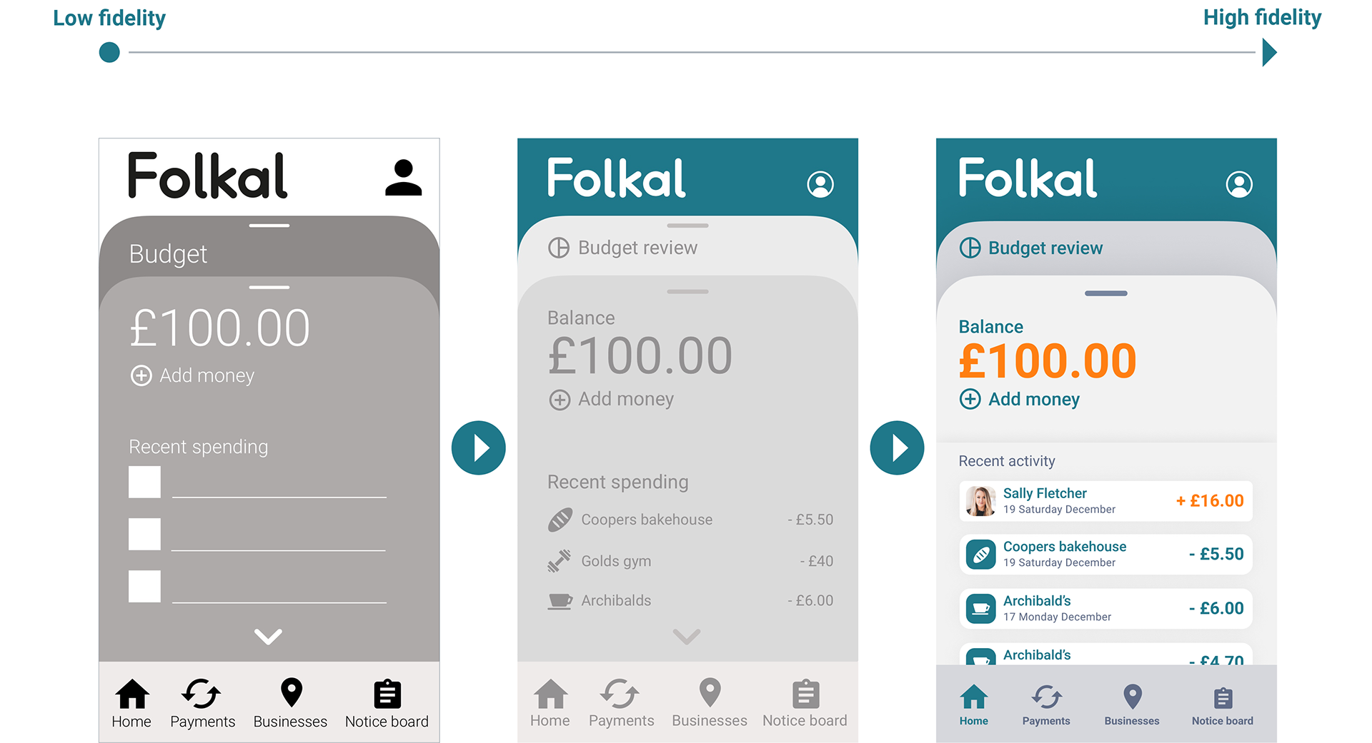
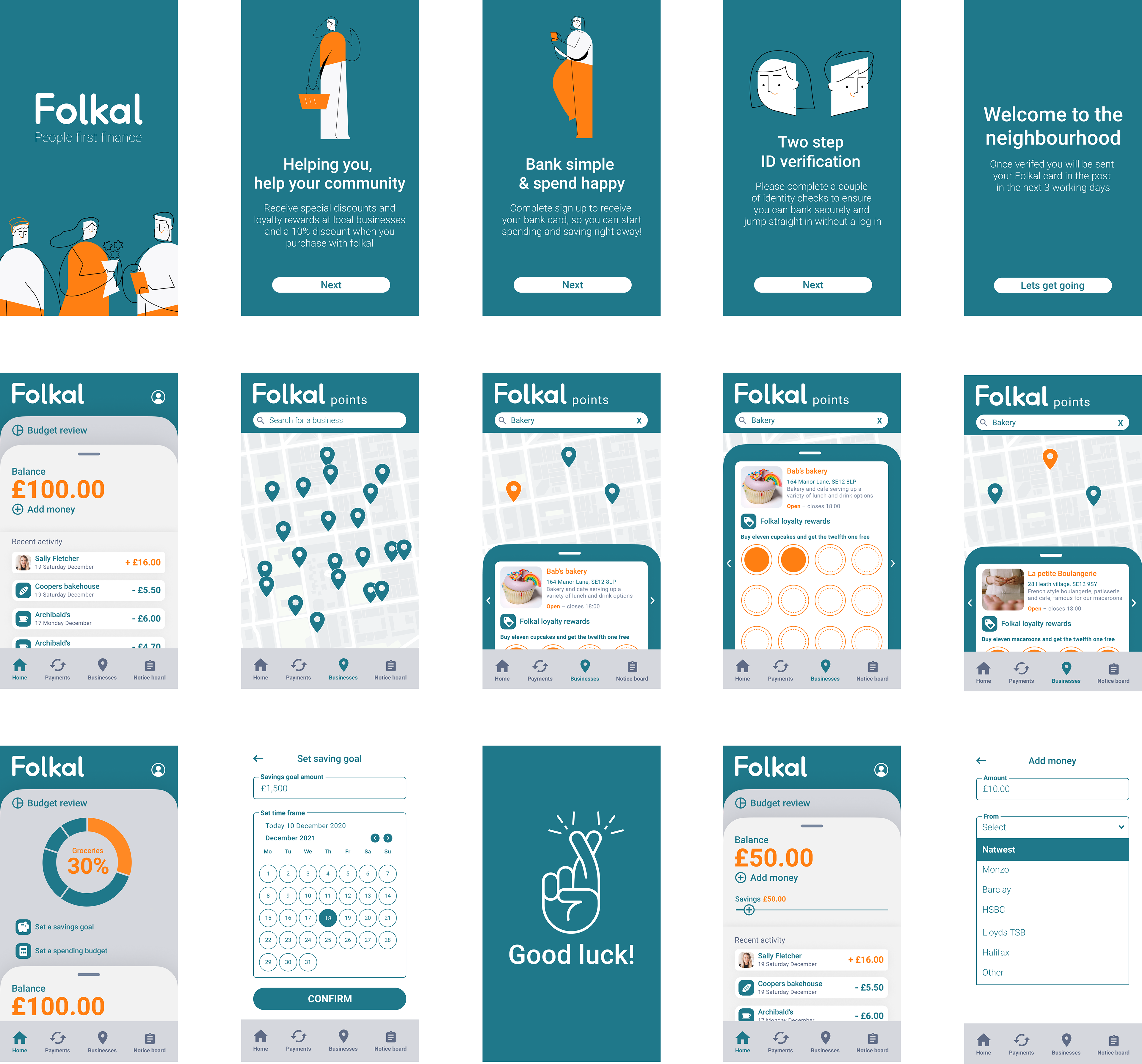
Home page/dashboard
The majority of users when trying to reach the budget section tried to press on it to reveal rather than swipe down, so I decided to make it both a swipe action and button, so swipe functionality can be learnt, but it works both ways.
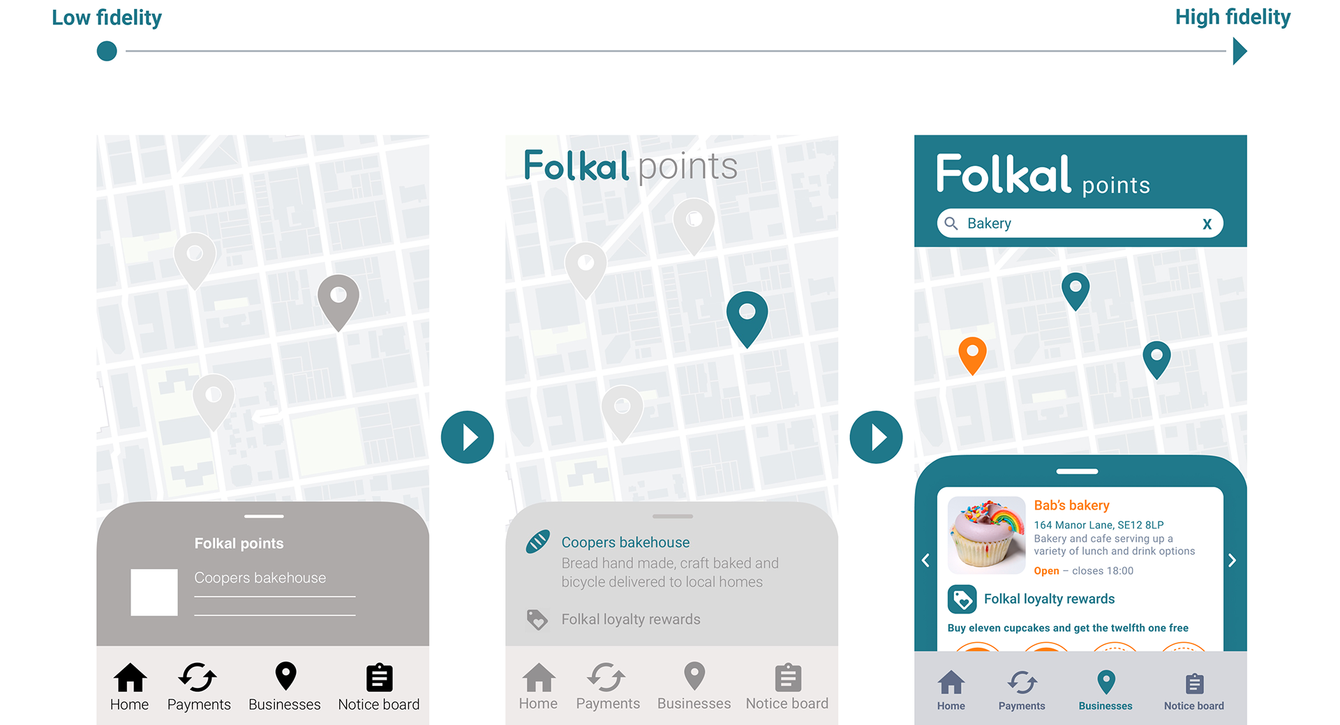
Business search
Users wanted improved search functionality to be able to type in what they were looking for rather than manually searching, also to be able to search for different types of business.
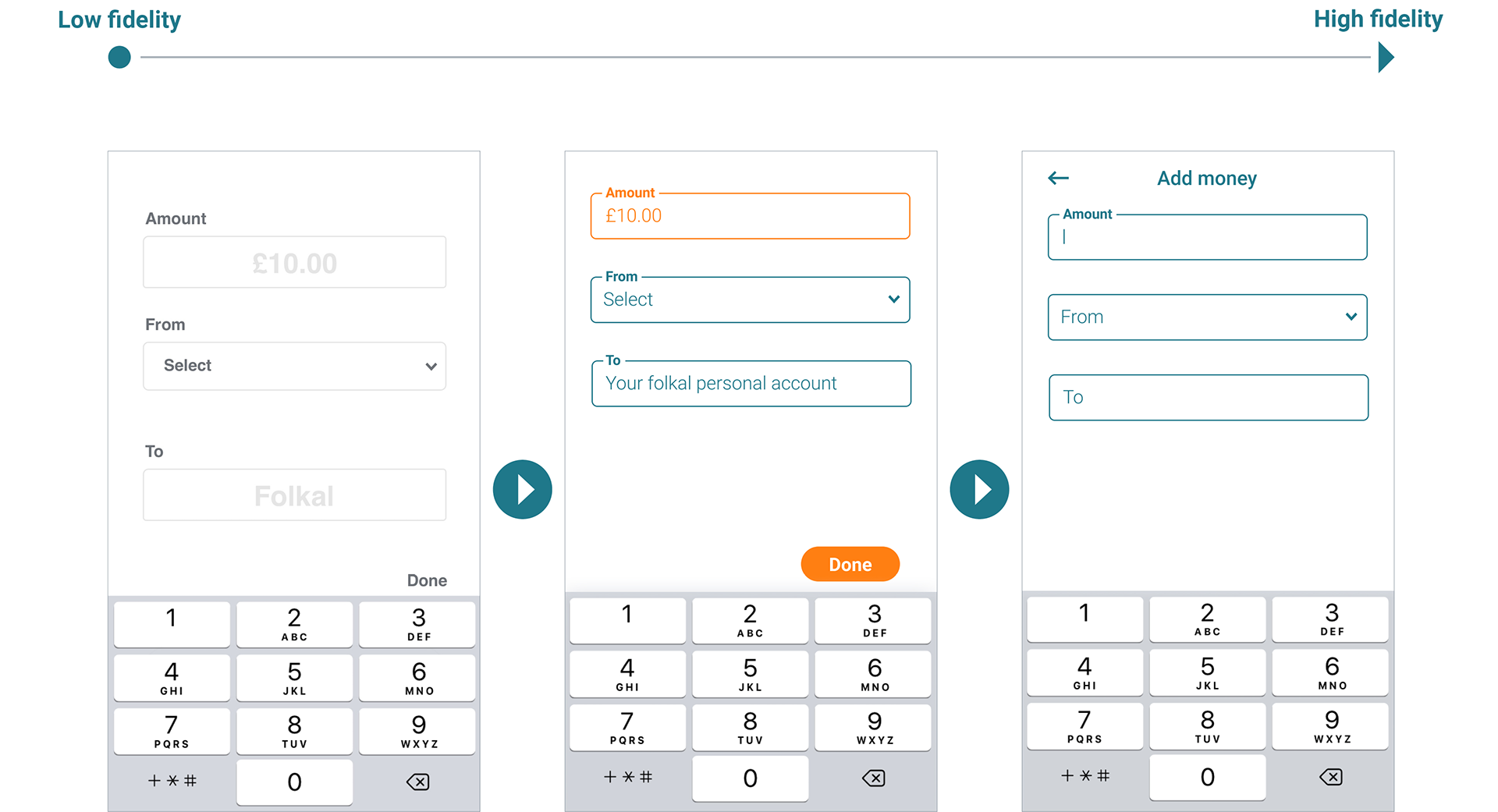
Add money
Users were confused by the 'done' button to move on to the next section. To make it more intuitive the text field changes when selected and the keypad simply exits once the next section is clicked on.
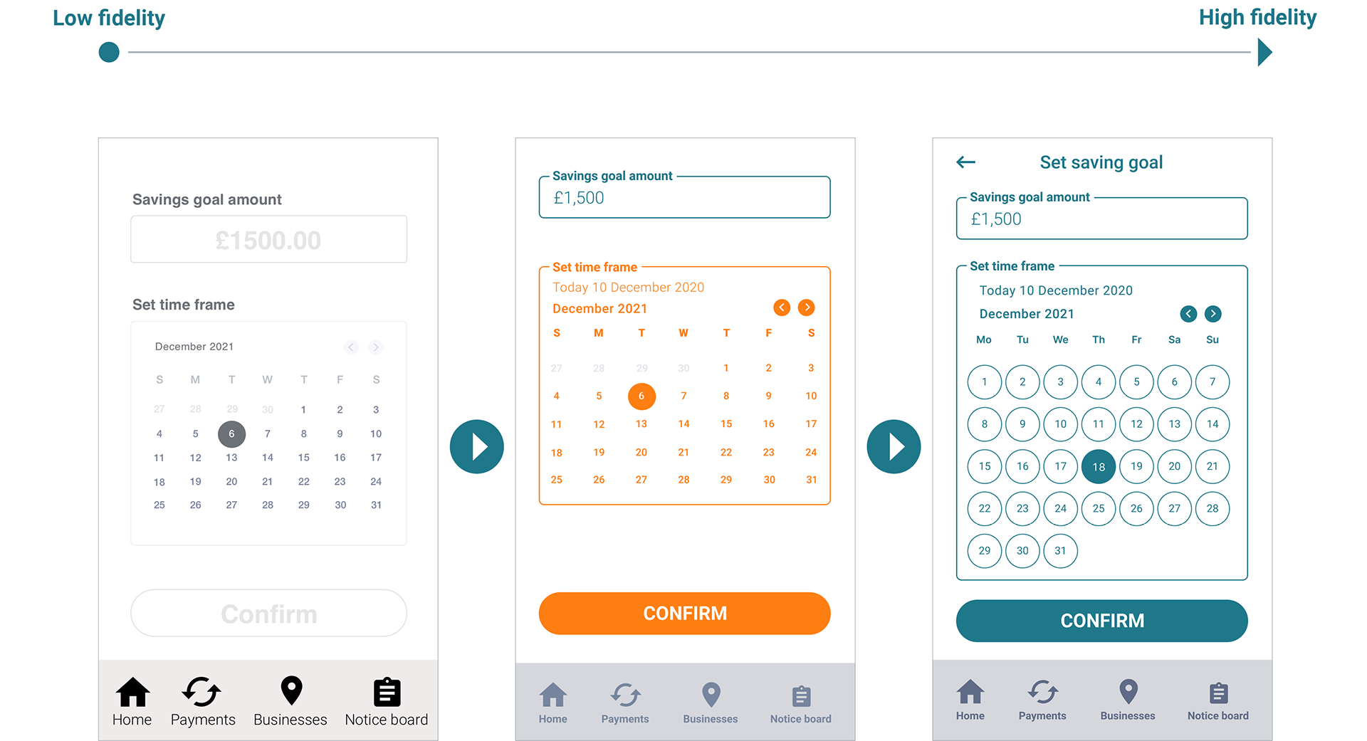
Set savings goal
Users struggled with the size of the calendar in knowing what they were selecting and also after colour contrast testing I amended the colours to ensure compliance with WCAG guidelines.

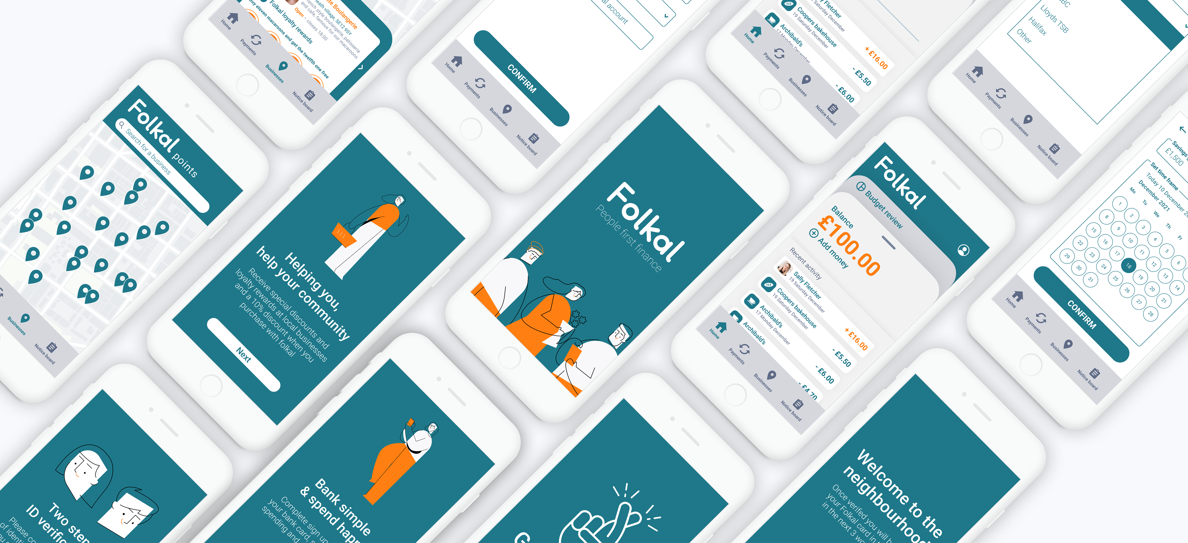
5. The final design
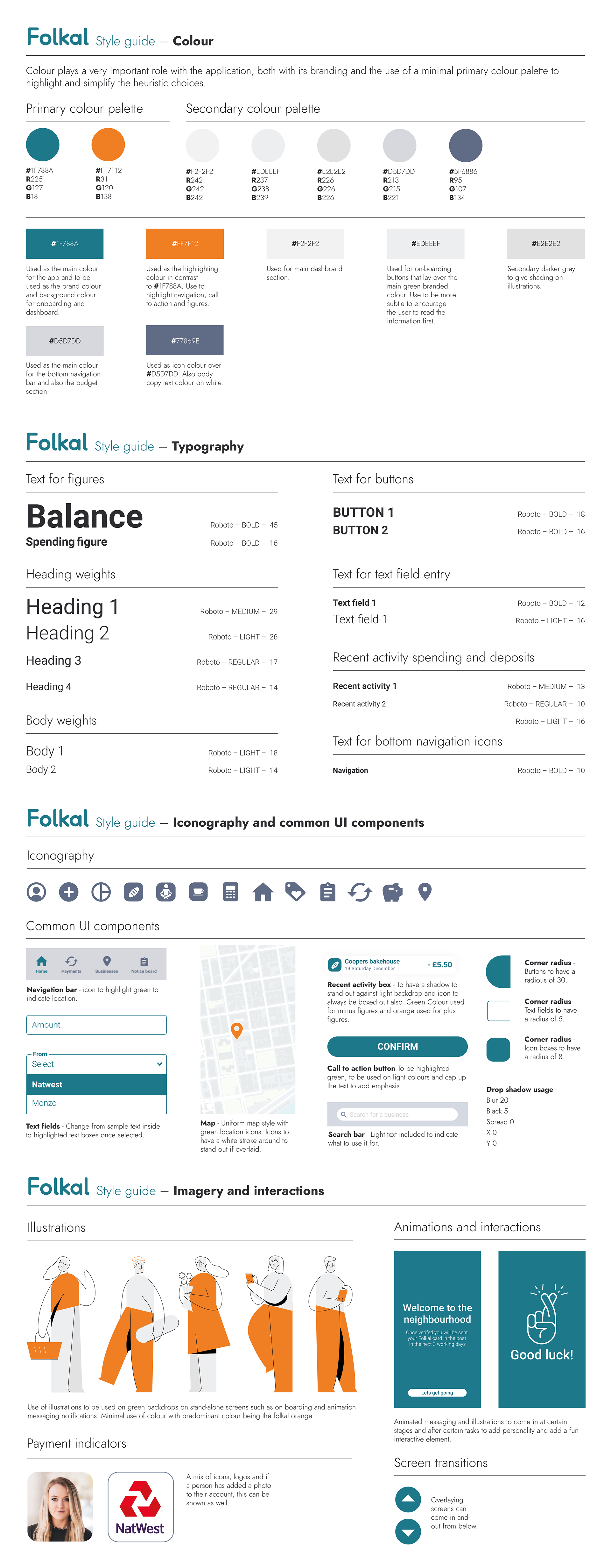
Design documentation – Design system
Now after rounds of testing and refinements I've been able to create a polished concept prototype that highlights core features and functionality. I've also created a style guide so that the concept can be easily understood when handing across for future development.
Sample pages
Please explore the final clickable prototype
⌄
Summary
Reflections
My original hypothesis was that Folkal users need a way to bank and shop simply, locally, securely and digitally because they want a way to support local businesses easily, in an experience that is rewarding for them both.
We will know this to be true when we see users intuitively using Folkal’s functionally and find it an engaging intuitive experience, using it regularly as their go-to tool for their banking and shopping needs. In doing so becoming fans that would recommend the product to friends.
As the project has been positively received by peers and test users, it has gone some way to proving this to be true and showing that it's an effective solution to the problem.
Key findings
Don’t get to attached to your design, iteration is key! Working through a detailed UX process helped me refine my design methodology. I believe it utilises a democratic process that ensures the end-user is always at the focus of any design decisions made.
Research rewards you. Putting in the work early on with good research will pay off later on, as you always have good information to back up your choices when required, it also helps in generating new ideas and validating hypotheses, rather than working on bias assumptions.
Think about designing for Accessibility early on. After assessing colour contrast and testing with Web Content Accessibility Guidelines (WCAG) I came to realise I needed to amend a lot of designs to ensure compliance.
Next steps
Through a further iteration design process the product could be expanded on in a variety of ways:
The interface needs to be considered if the product was accessed by business owners rather than customers.
The noticeboard function needs to be worked on and developed. How will business owners notify users of any offers and news, then how users can view and edit the way they receive that information.
Development of additional feature ideas, such as a crowdsourcing option in which you can help fund and support local business ventures, community projects and causes.
Thanks for reading
If you like my work, please do get in touch