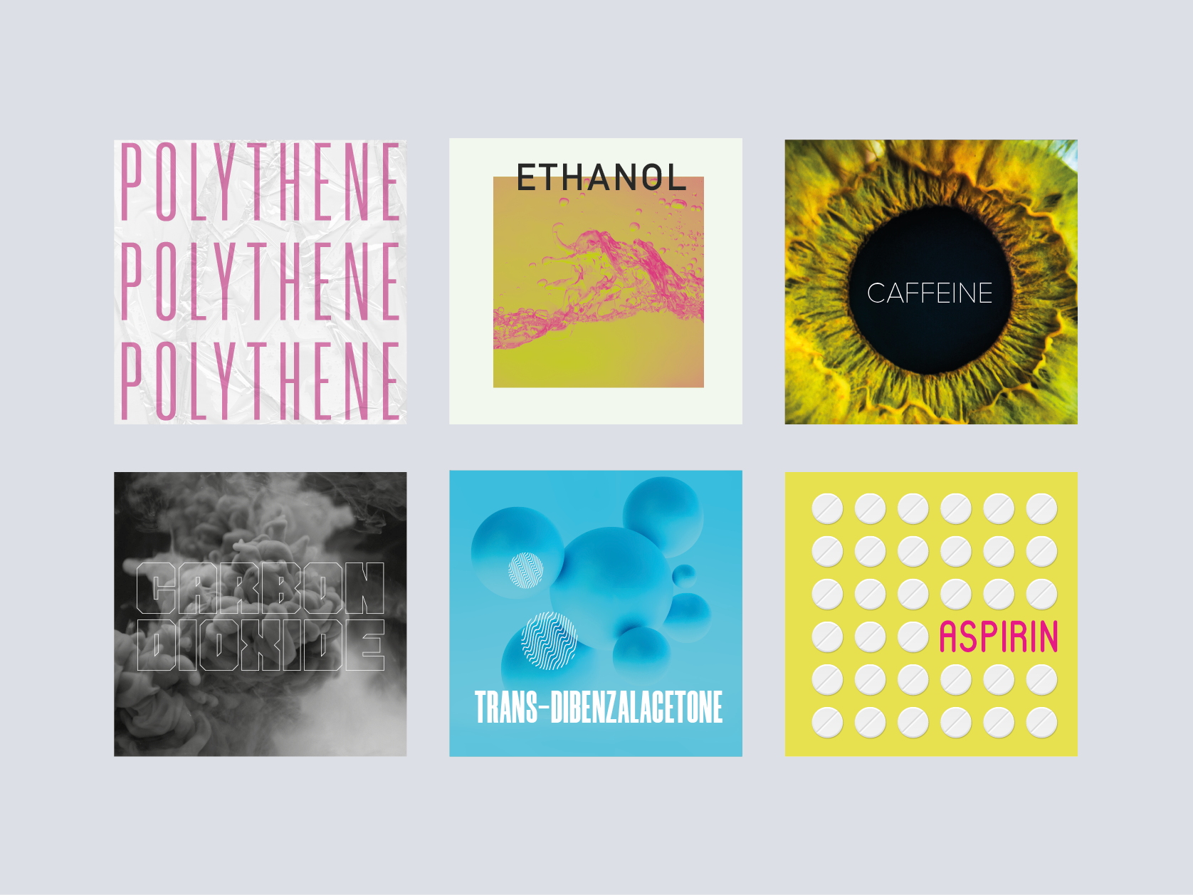
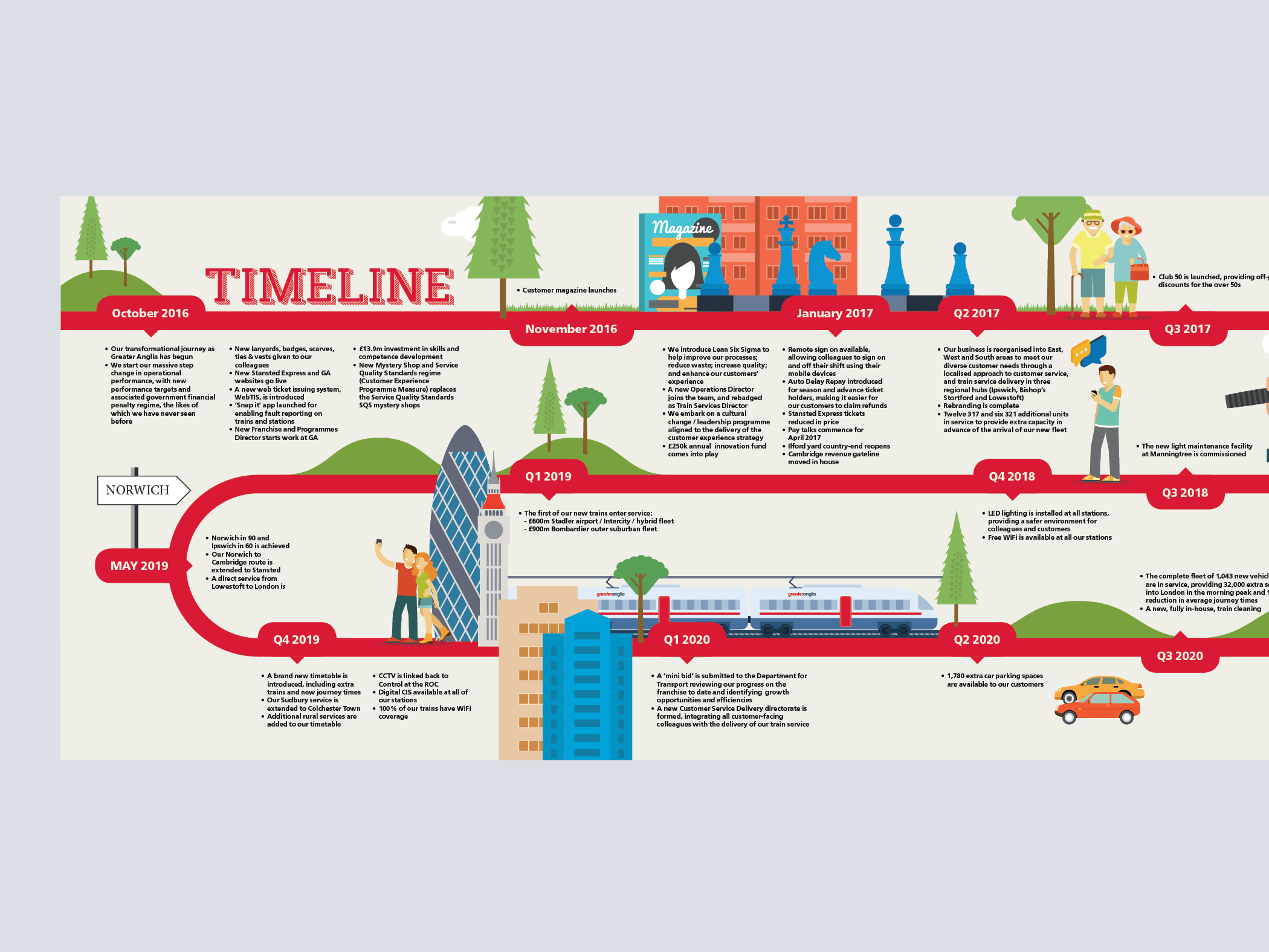
Marketing material for the annual Summer Science Exhibition. This is an interactive experience highlighting the relationships between art and science, helping promote excellence in science for the benefit of society.
My role
Concept developer and graphic designer.
Tools
Illustrator, Indesign, photoshop.
The problem
The Summer Science Exhibition is an annual event that attracts many visitors but often from the same target audience and background. For 2019 they wanted to stand out and also widen the demographics of the event.
Research
Competitive analysis
One of the main points from the brief was that the stakeholder wanted to stand out and be different to other competing voices.
Key quote researched
After looking at ideas around questioning, science and impactful messaging that makes you think i discovered a quote that i thought would be good to incorporate in someway.
“Half of science is asking the right questions”
Roger Bacon
A medieval English philosopher and Franciscan friar who placed considerable emphasis on the study of nature through empiricism.
Design
Initial concepts
I wanted to explore ideas around entering and experiencing a new world and also simple typographic based concepts that focused on the thoughtful nature of the work being done.
Simplified route
I also wanted to give a version where the key thought was the focus, as the brief noted a desire to stand out, grab attention and make people think.
Testing review
Key feedback
Out of all the concepts the key steak-holders preference was towards the simplified version as they found this had the best connection with the brief. Standing out from busy competitors marketing and being something that is bold, impactful and makes people think. This being said there was a worry it was a bit too simplified and if it could in some way have a bit of added embellishment to connect to the messaging, but not take away from it.
The result
Edits and refinements
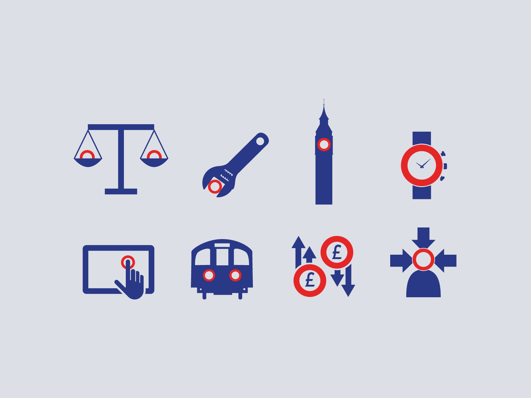
After the feedback that was given, messaging was edited down and key connecting icons were added to inject a bit of added fun and personality to the key questions. To attract new audience members such as tourists the marketing would also be a takeover of the closest tube station elevator and platform which often has a footfall of large tourist numbers.
Thanks for reading
If you like my work, please do get in touch
